freshbox
Freshbox
Overview
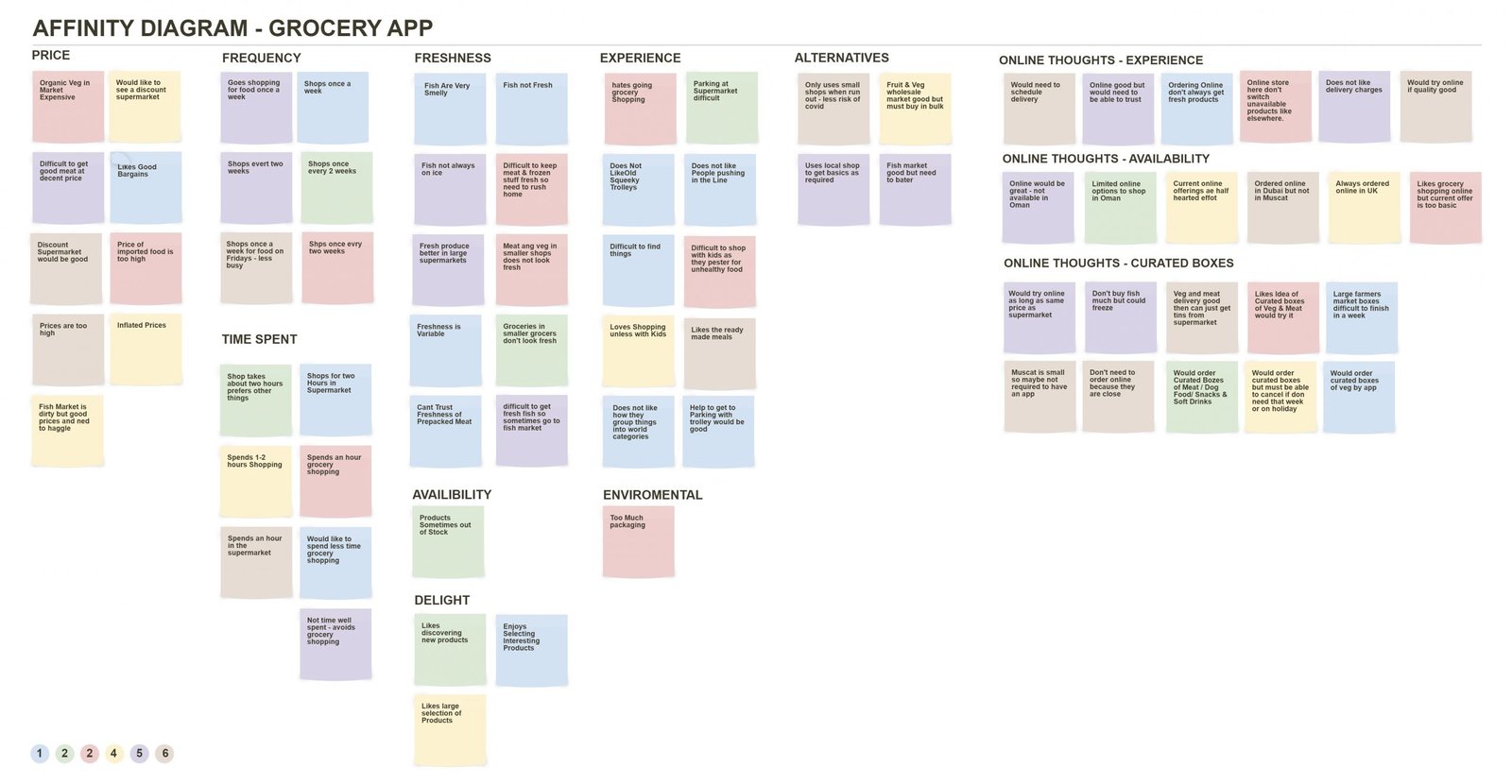
This project was based on user research gathered in Muscat Oman regarding the grocery shopping habits. Users pain points were analyzed and a solution created to overcome the difficulty of sourcing reliable fresh produce. The analysis was collated into an affinity diagram, shown below.
My Role
I was responsible for the full delivery of the final product with valuable input from my mentors and colleagues who worked on alternative options.
Affinity Diagram

Problem
Follow user interviews data was analysed and collated to establish pain points and potential solutions. It was established that many customers wanted the convenience of their local grocery stores but struggled to find good fresh produce which was only available at the larger stores.
Audience
The grocery app that was developed was aimed mainly at larger households and families who could benefit from home delivered curated boxes of meat, fish and vegetables.
Sitemap

Solution
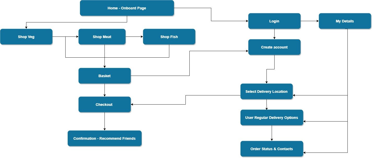
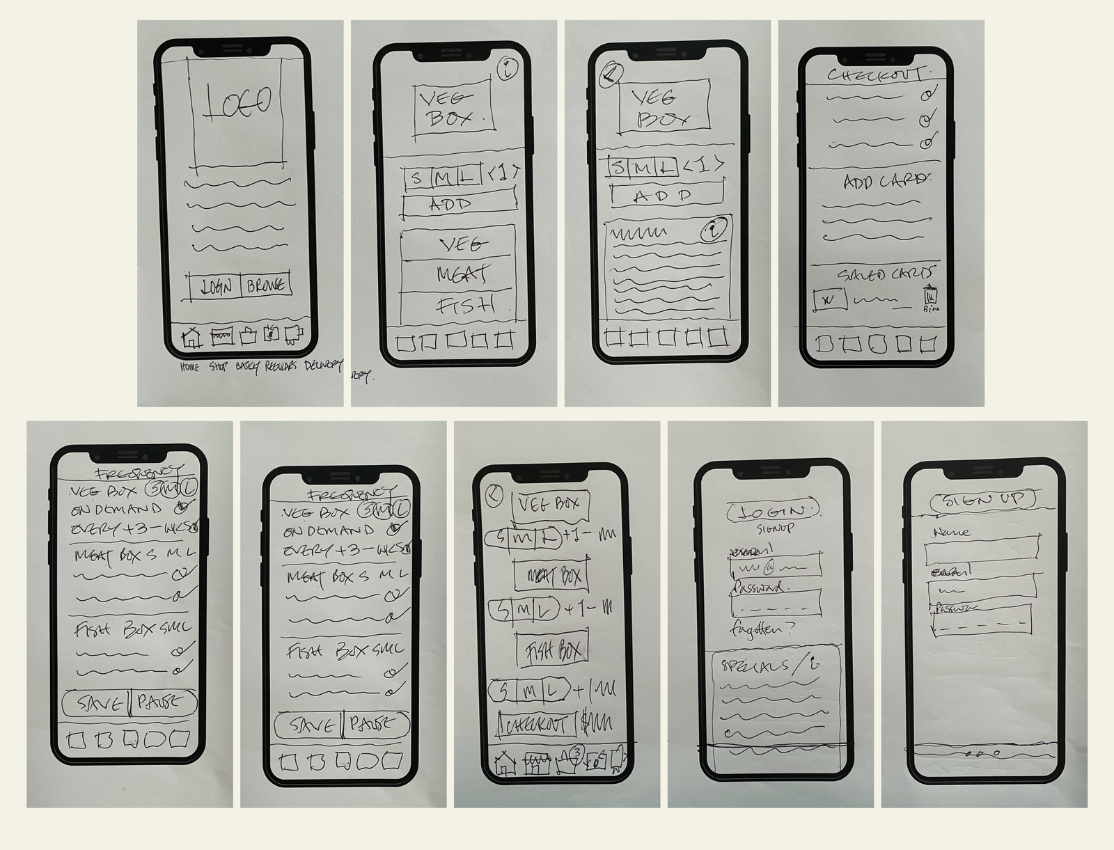
The design of the app was structured to be a very simple way for customers to select a home delivered box of fresh produce. It was decided to incorporate a way for users to either make one off purchases as well as setting up regular deliveries.
Learnings
The app was well received by the customers who were interviewed and a further round of development is currently underway prior to taking the project live.
Early Wireframe Sketches
